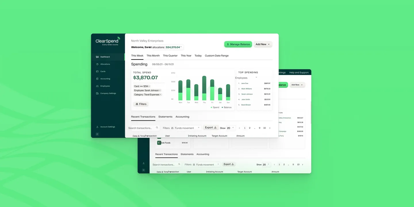
ClearSpend Spend-Control Platform
ClearSpend launched a spend-control platform for small businesses with the design system around 10% defined when I joined. As a solo designer on an 8-month contract, I shipped 50+ components to WCAG 2.1 AA and cut budget setup time in half.
Framing the product
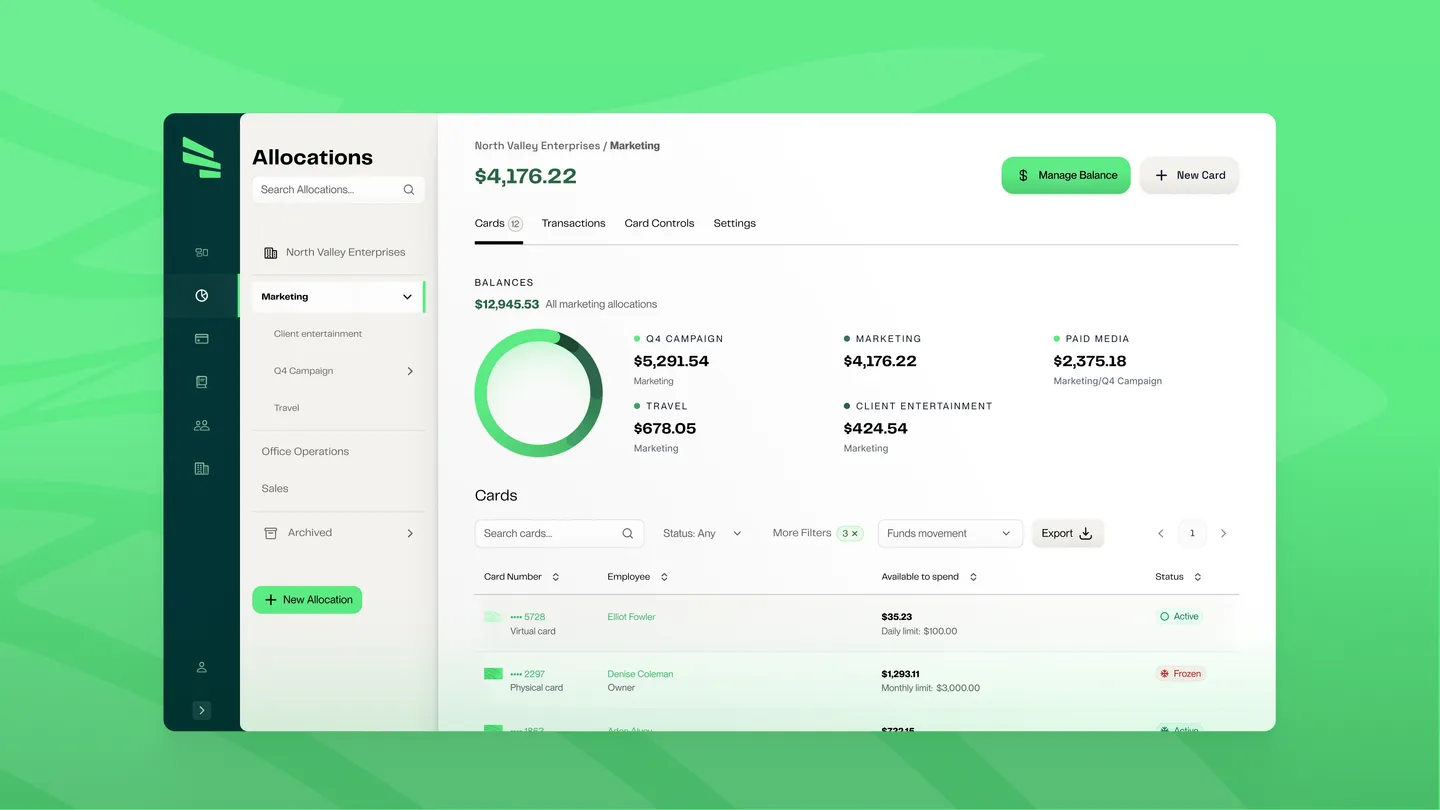
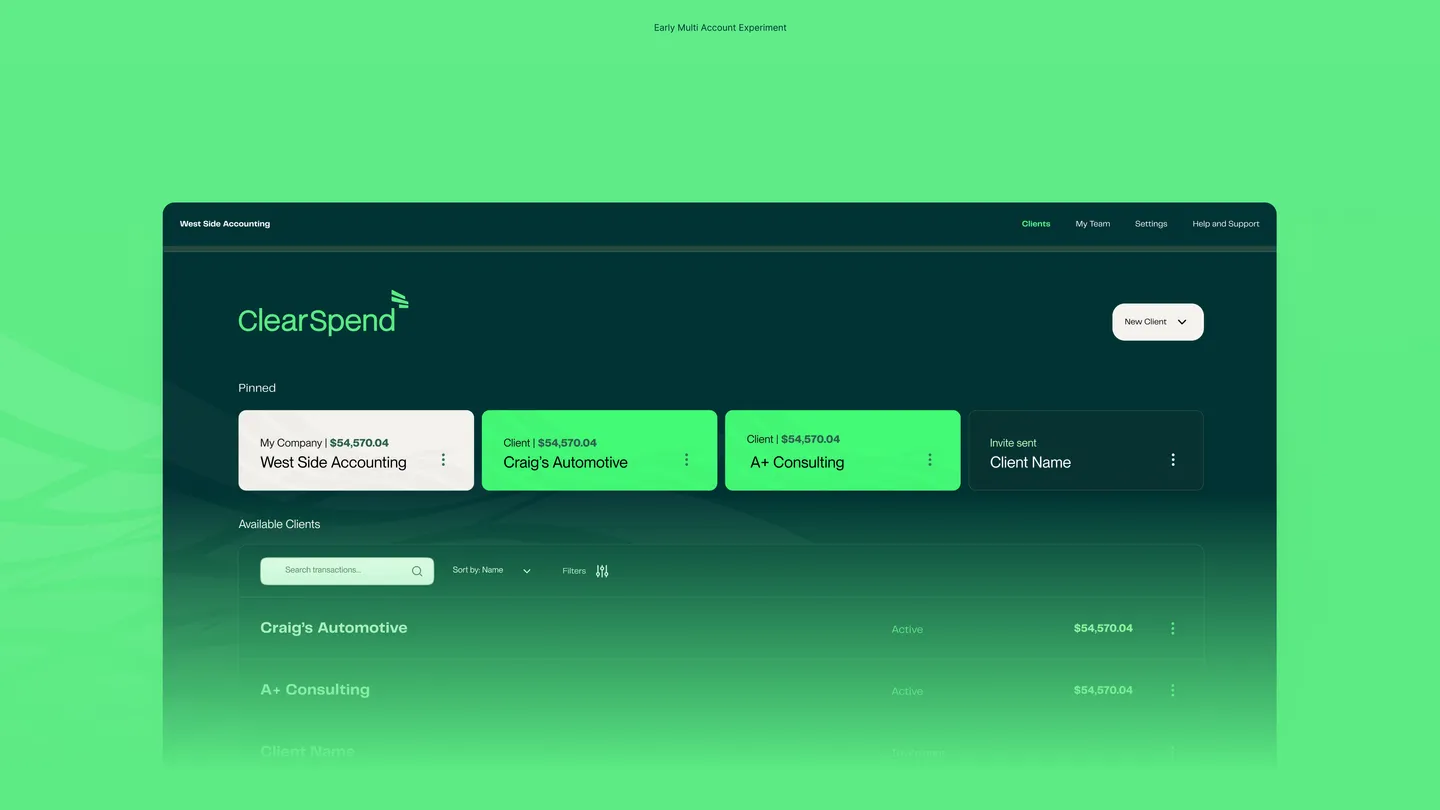
ClearSpend was a spend-control platform for small businesses. Operations managers and bookkeepers used ClearSpend to configure card limits, budget hierarchies, and have visibility before money was spent at the team level, preventing the monthly statement from being a postmortem.
The company shipped February 2022 with virtual and physical cards, configurable limits, parent/child budget allocations, and a real time ledger. The product’s stated goal, in their own words: “to work with minimal human participation.” Managers set the guardrails, allowing employees the autonomy to spend within them, and the system handled the rest.
Three highlights
When I joined, engineering had begun building the product, the brand agency had delivered an identity, and the design system was roughly 10% defined. The product needed to feel like a serious financial tool from day one, with a proof of concept due by Christmas to facilitate a public launch in February.
The timeline didn’t leave room for the system work to lag the feature work.
Three calls shaped everything that followed:
Building an accessible product palette
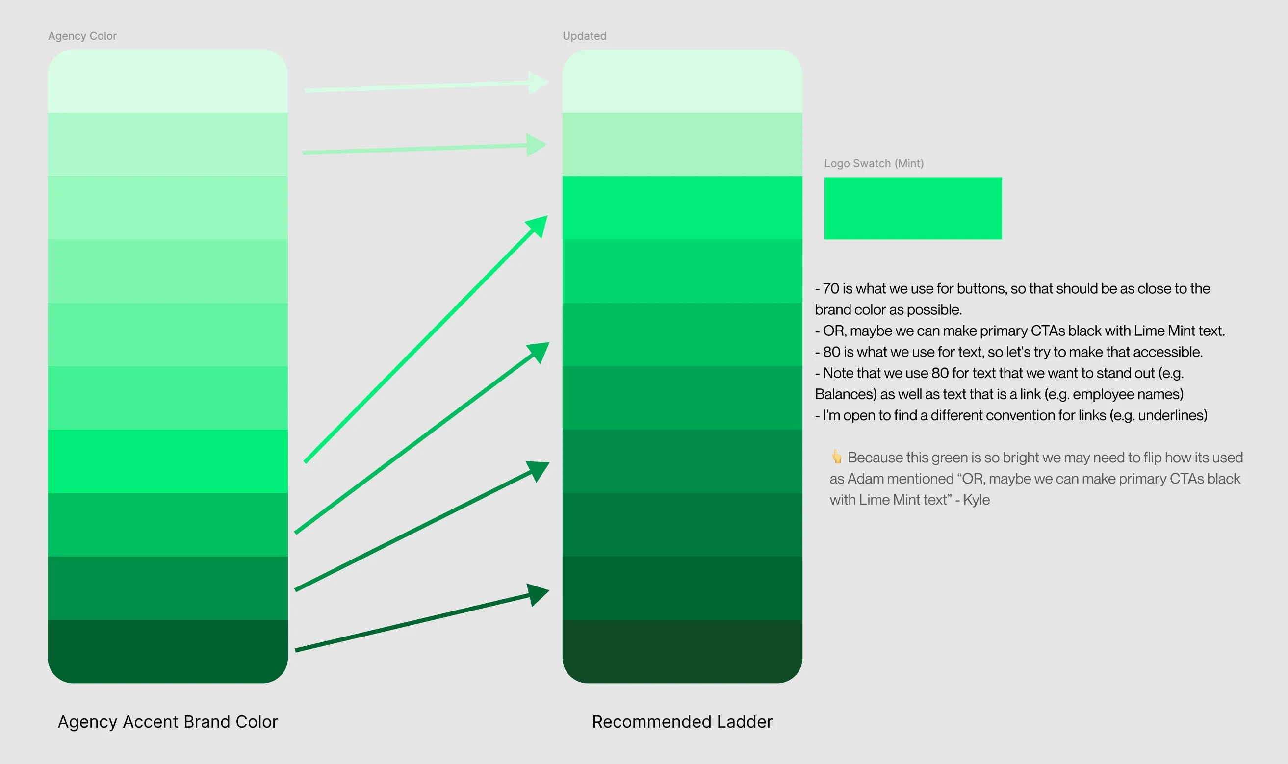
The brand palette was designed to be flashy and eye catching. I found it very hard to stare at for long periods of time without eye strain. While flashy, the primary colors did not pass the bare minimum contrast ratios needed to make working in the product long term a pleasant or legible experience. My solution was to build out an accessible product palette we would only use in the product to allow for legibility targeting at least AA contrast.
I extended the palette so existing designs could migrate to the accessible values with the updated colors. I also built some examples and a prototype to communicate to leadership why we needed to be thinking of color like this.
Strategically capping budget hierarchy
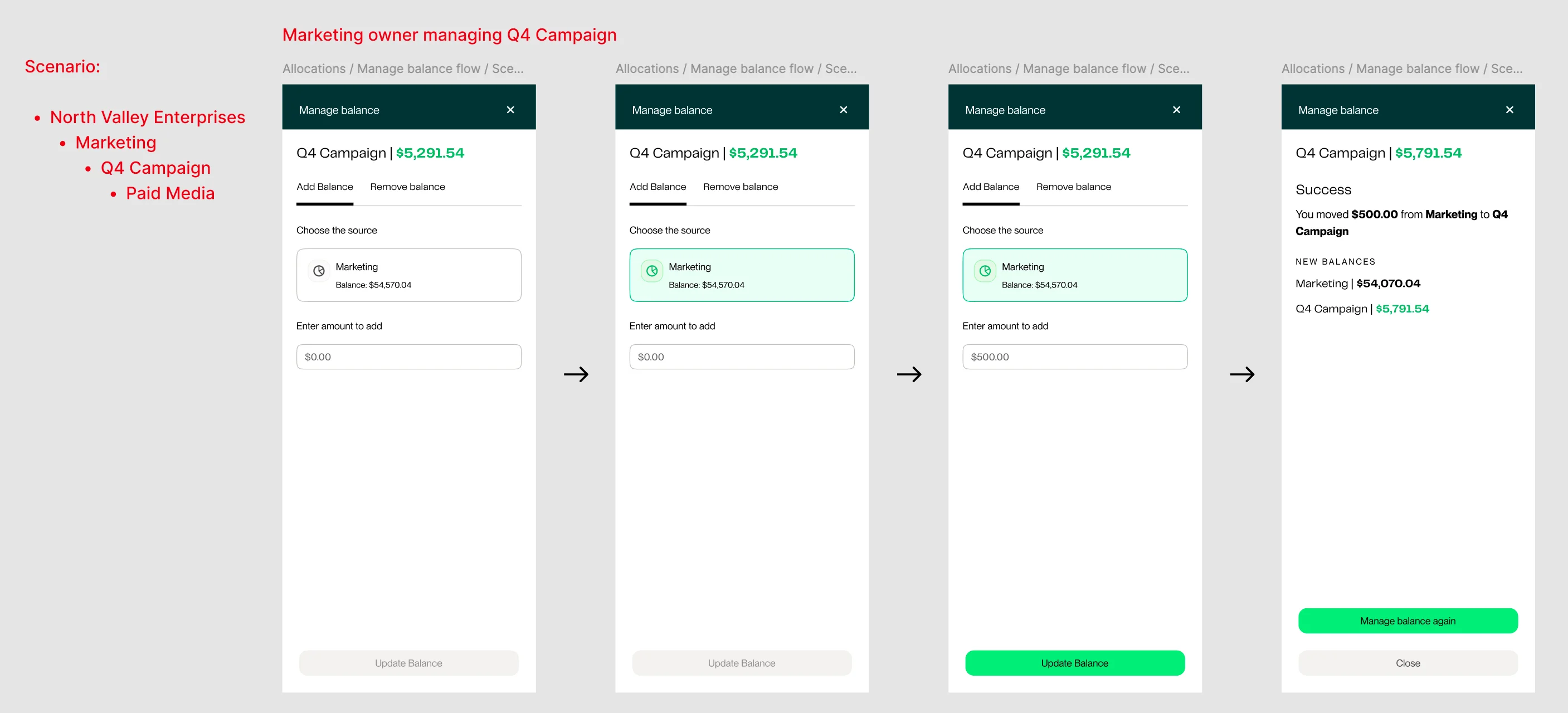
Tracking and managing money at multiple levels is complex work. ClearSpend was designed to give company owners a clear view of their internal expenses. Because the target market was small business owners I wanted to optimize the UX around tracking cash and budgets to these smaller teams. Talking with small business owners, we confirmed that five layers of hierarchy were practical, and setting a cap prevented circular allocations or mismanagement by people less familiar with accounting tools. The deeper the nesting, the harder the UI gets to navigate, and the more likely the product’s “minimal human participation” promise starts to break down. I was building out user stories to map edge cases and document intended behavior. That’s when I flagged the hierarchy cap to Adam, before we got deep into building the budget screens.
Building out consistent editing/filtering patterns
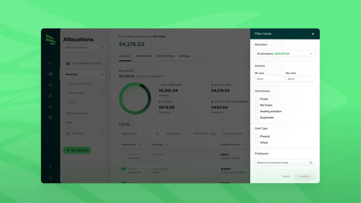
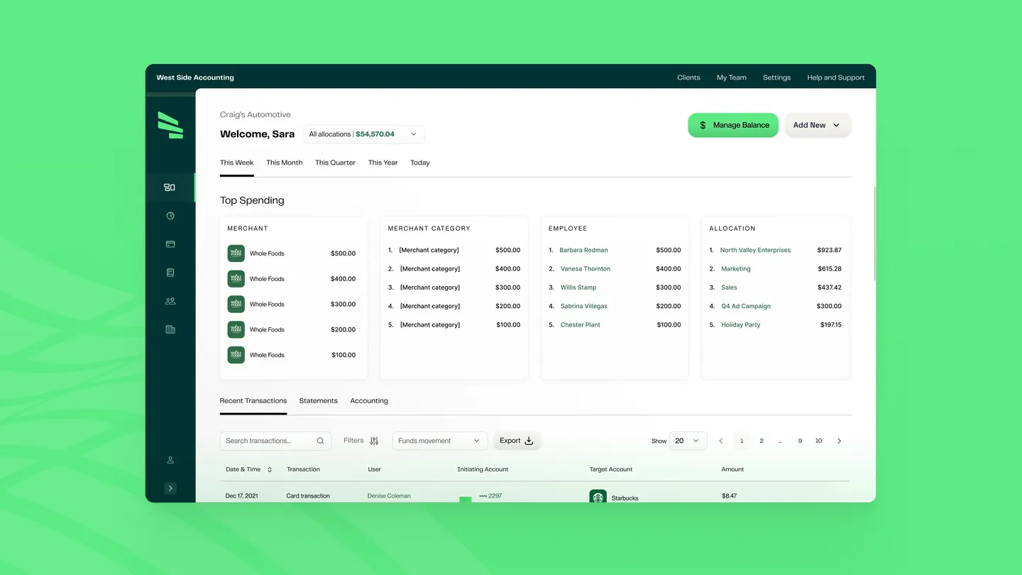
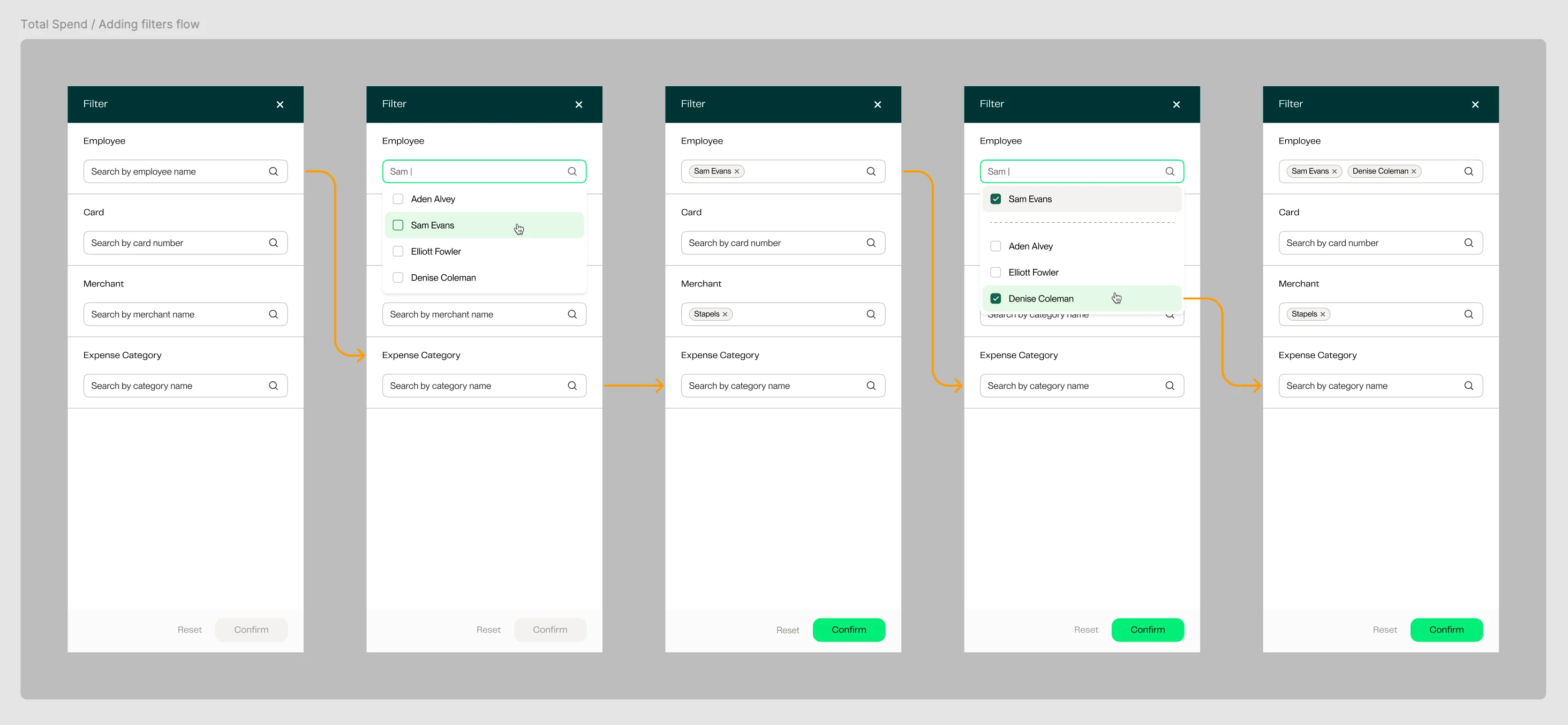
I consolidated multiple inconsistent editing patterns into one unified side panel and built it to be extensible, later editing surfaces and filter flows being plugged into the same pattern. The system stayed coherent as scope expanded. When leadership pivoted in Q2 2022 toward accounting firms as a primary customer, the pattern absorbed the multi-account requirement without a rewrite.
Impact
ClearSpend shipped on time. The product launched February 2022 with 50+ components, WCAG 2.1 AA accessibility, and a design system built to hold under feature pressure. The work I delivered on the contract removed clicks across every common operations task. Data management collapsed from multi-screen workflows into inline side panel edits. Budget setup compressed by half once the side panel was the same surface everywhere. Managers could trace where money came from and where it was going in fewer steps than the original designs had required.
Contract timeline from near-scratch system work to public launch
Budget setup time once the side panel unified the editing surface