
Pin Dropper
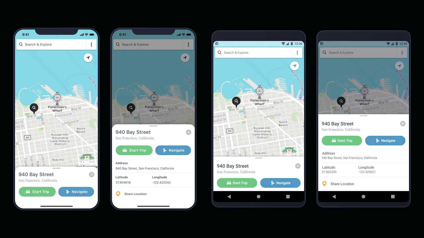
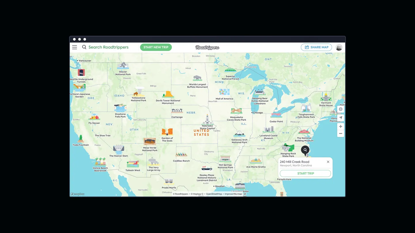
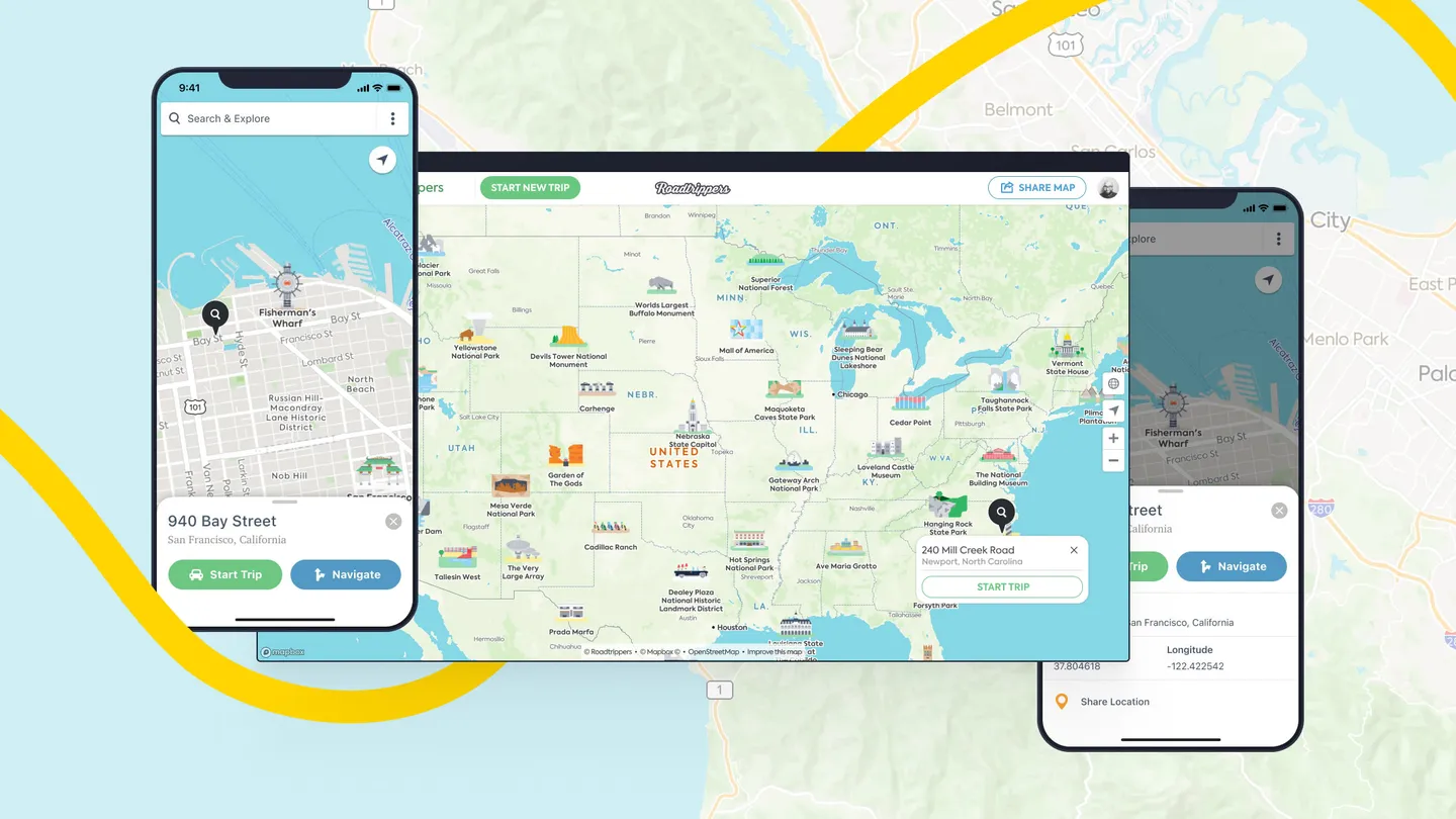
Roadtrippers had a feature gap competitor apps had been shipping for years, and users requested it constantly: the ability to drop a custom waypoint anywhere on the map. I designed Pin Dropper cross-platform across iOS, Android, tablet, and web. Over a million pins got dropped in trips within the first few months, changing how users started trips entirely.
The Short Version
Roadpass Digital is the parent company behind a portfolio of outdoor travel apps. Roadtrippers, the road trip planning app, was the highest-traffic and highest-revenue product in the portfolio.
Roadtrippers served over two million monthly users planning road trips across iOS, Android, tablet, and web. The product searched millions of points of interest curated from partner data and user submissions, with POIs as the unit of work.
The product addressed a specific gap incorrectly. Roadtrippers could search millions of POIs. It couldn’t handle “the overlook five miles past the state park,” which is exactly where road trippers actually go. Competitor apps had been shipping custom waypoint placement for years. Users were asking for it constantly in support tickets, App Store reviews, and feedback channels. The product was treating a core road-trip behavior as out of scope.
The cost surfaced in three places. Support tickets piled up from users trying to add stops that didn’t have an address. App Store reviews repeatedly named the missing feature. Most quietly, trip creation got slower because users had to find the closest POI to their actual destination and add a note explaining “actually 2 miles north of this.” The gap between where road trippers go and where addresses exist sat at the center of the planning experience.
I designed Pin Dropper as the sole designer, shipping cross-platform across iOS, Android, tablet, and web in fall 2018. Over a million pins got dropped in trips within the first few months. Trip creation rose 11%. Location-related support tickets dropped 18%. The feature changed how users started trips: drop a pin in a direction, build the route around it, find cool stuff along the way.
The Problem
The visible problem was a feature gap. Road trippers planning anywhere off the address grid were running into a wall. The deeper problem was that the gap had been visible for years. Users had asked for custom waypoint placement repeatedly, and competitor apps had shipped versions of it long before Roadtrippers caught up. The product’s most active feedback channel was telling us the same thing every quarter.
The cost spread across the product. Support tickets piled up from users trying to plan trips around destinations that didn’t have addresses. App Store reviews repeatedly cited the gap. Most quietly, trip creation slowed because users had to find the closest searchable POI to their real destination and add a note like “actually 2 miles north.” The workaround scaled with trip ambition: a weekend trip to a campground had one workaround stop; a multi-week trip into national parks had a dozen.
A simple “add address by lat/long” form would have shipped without solving the user need. People think in landmarks, distances, and visual reference points. The work had to live on the map itself, where users were already pointing at the place they actually meant.
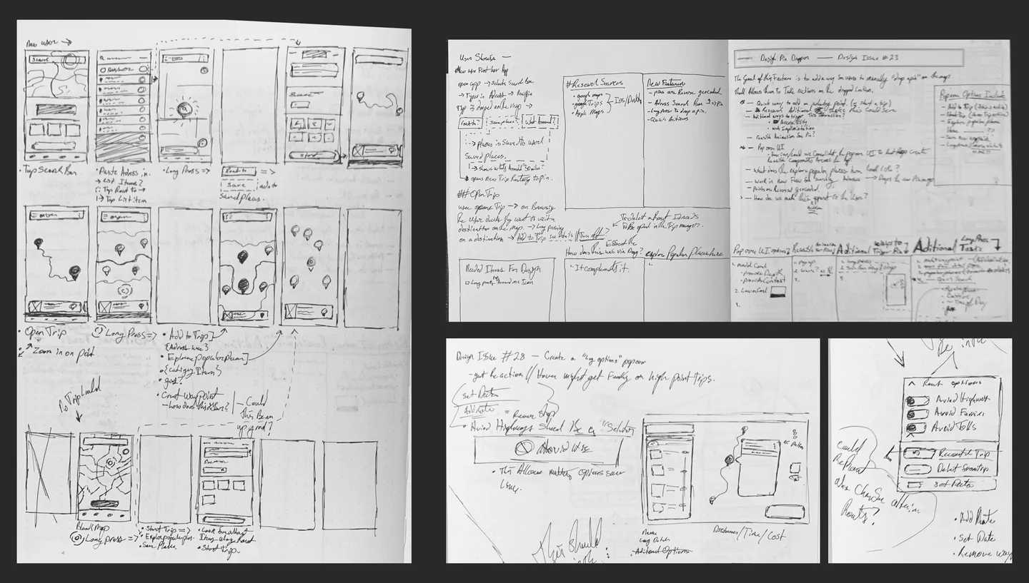
Process: Sketches
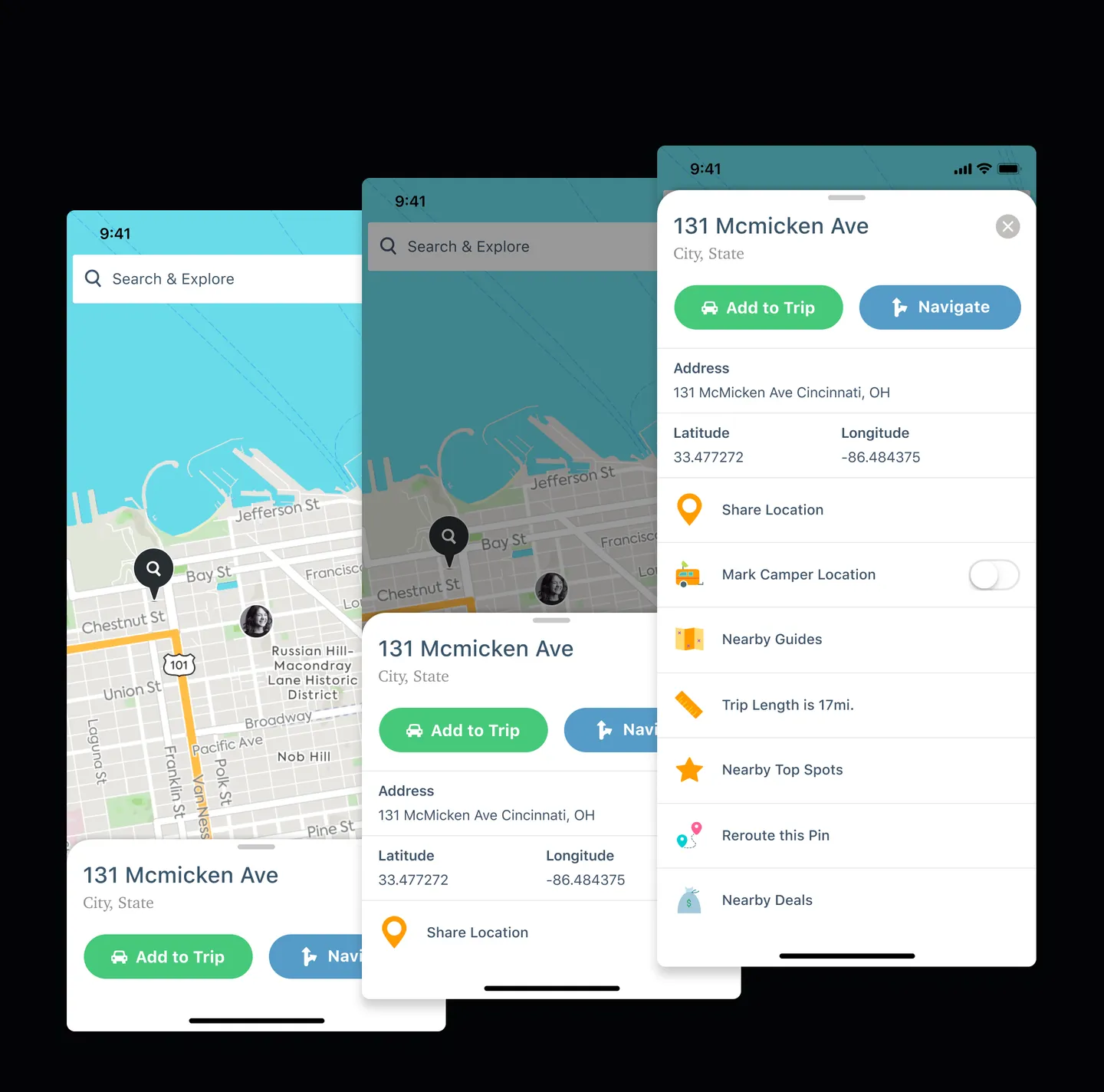
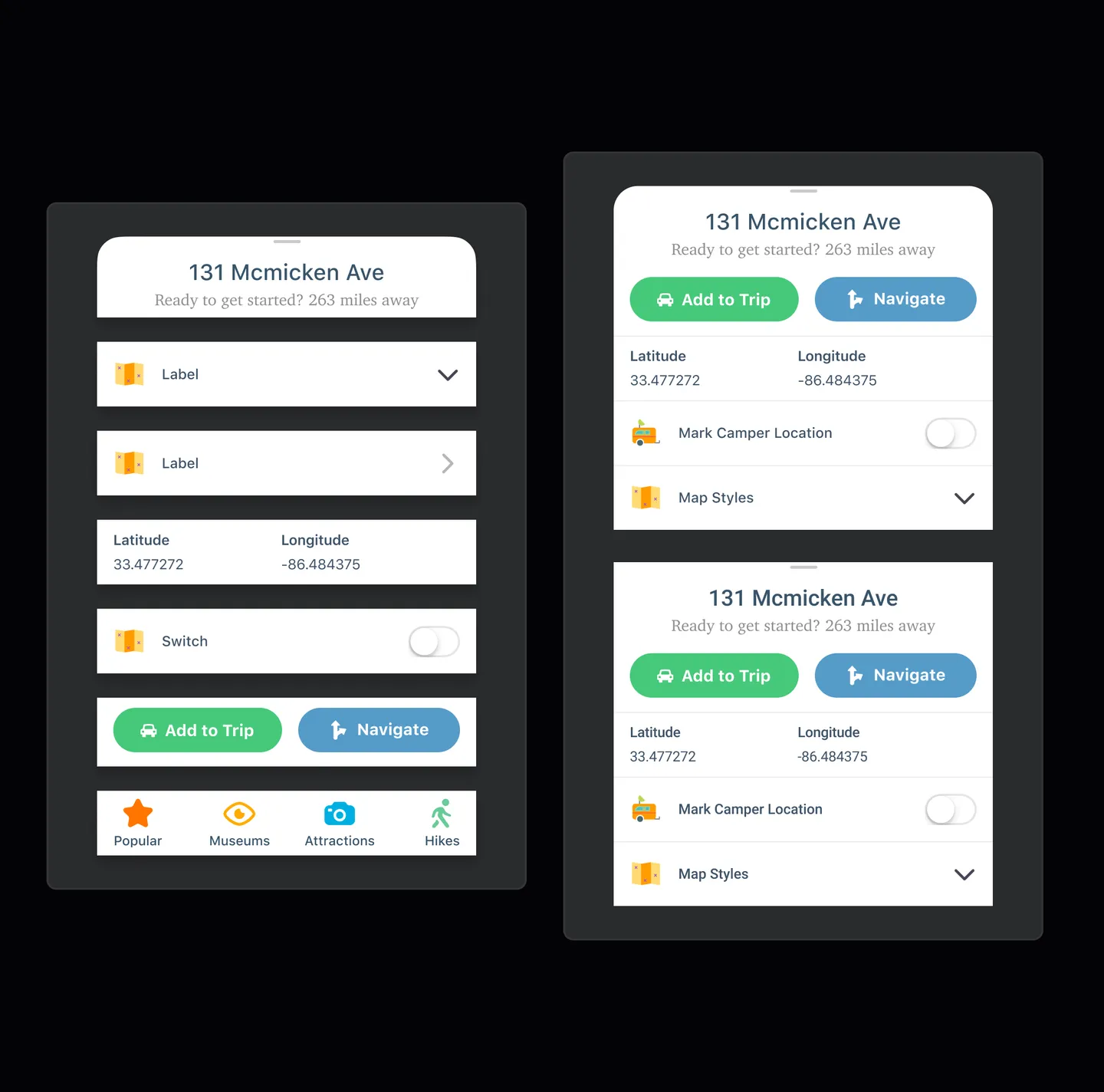
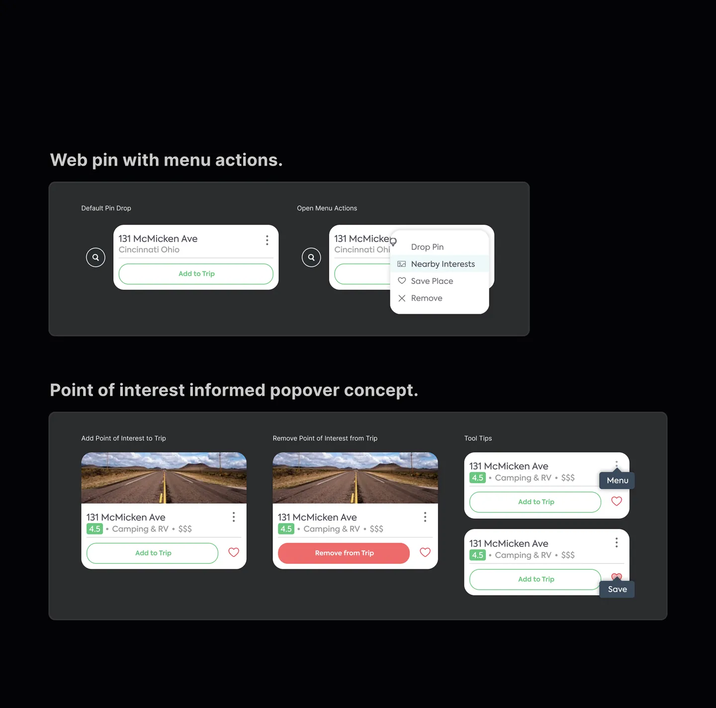
Process: UI Explorations
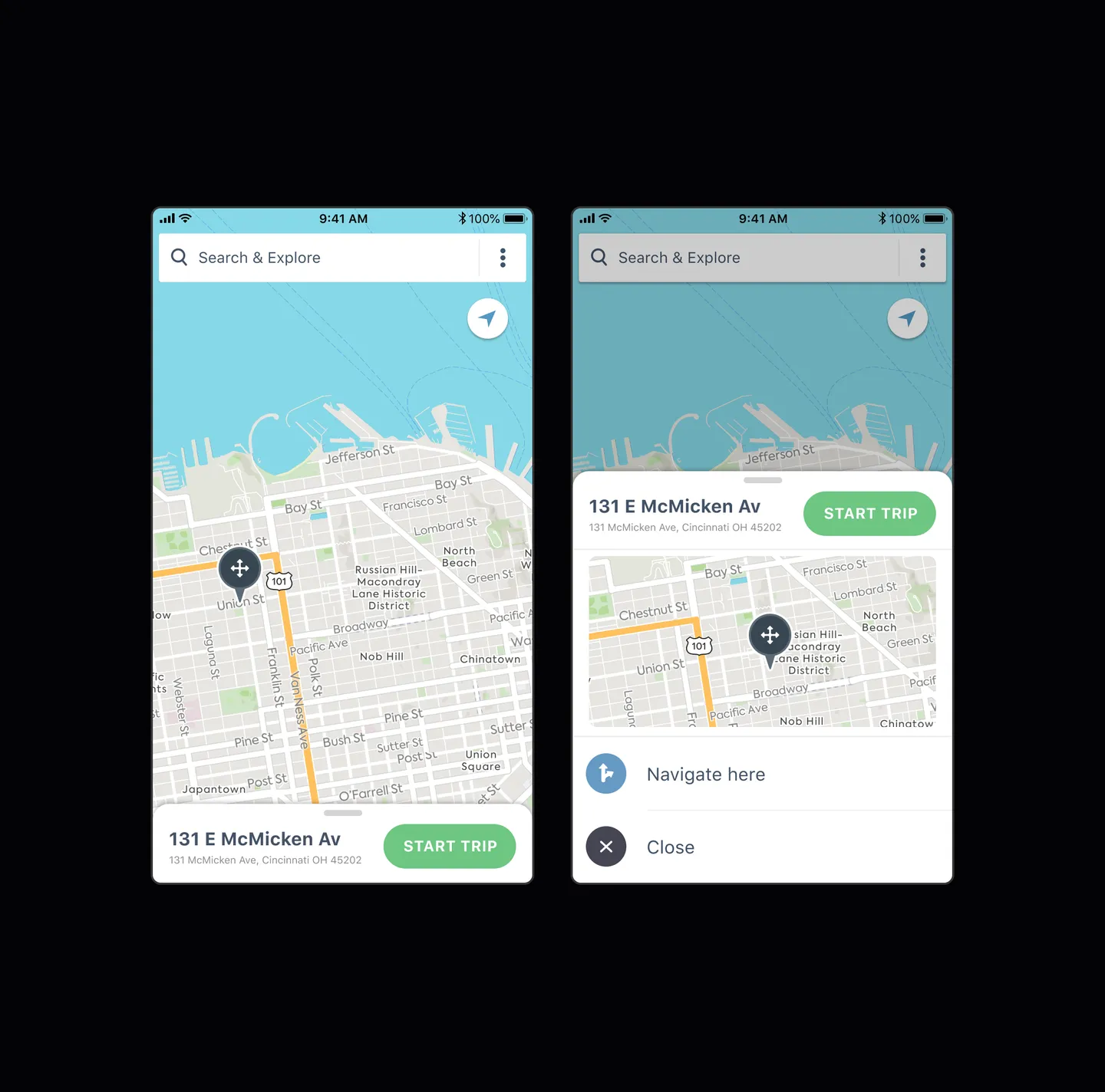
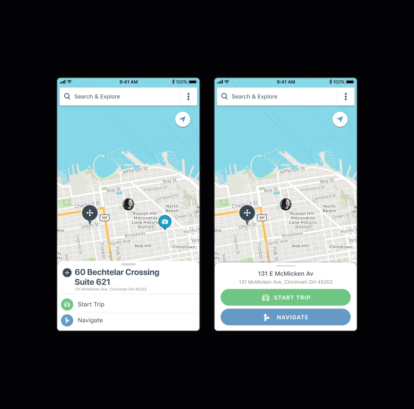
The Design Call
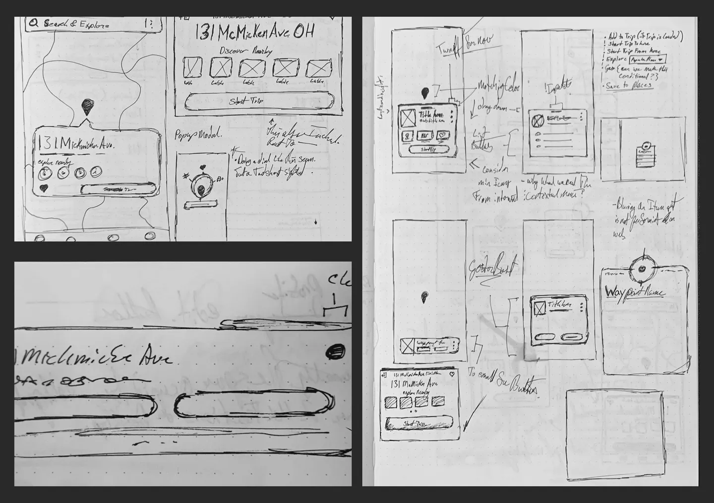
I designed the interaction around how users already thought about location on a map: point at the place, name it, save it to the trip. Long-press to drop a pin. Tap to refine the position. Inline naming with a default that matched the nearest landmark. The pattern needed to feel native on iOS and Android, scale to tablet, and work on web where the input device was a mouse rather than a thumb. One interaction, four input contexts.
The hardest problem was performance. The interaction itself was the easier half. A single pin dropping on a map is easy to make look good. Four hundred pins on a five-year-old phone is where the decisions actually get tested. I designed the rendering logic for the stress case. The demo would have passed either way. The architecture had to hold up when a user dropped pins along a forty-stop loop through the West.
The component system I built for Pin Dropper was deliberately extensible. Map overlays, drawer transitions, pin-state rendering, gesture handling. Every piece was structured so the team could reuse it without forking. That choice paid back a year later when the same architecture became the scaffolding for the entire GPS navigation feature.
What Shipped
Over a million custom pins got dropped in trips within the first few months. Two million monthly users adopted the feature across iOS, Android, tablet, and web. Trip creation rose 11%. Location-related support tickets dropped 18%. Most importantly, the feature changed how users started trips. People began dropping a pin in a direction and building the route around it, finding cool stuff along the way. A planning behavior the product hadn’t been built for became one of the most common ways users opened a new trip.
The deliberately extensible architecture paid back a year later when the same component system became the scaffolding for Roadtrippers’ GPS navigation. The drawer patterns, the overlay system, the gesture architecture, the rendering logic built for the stress case. Pin Dropper shipped as a feature. It carried forward as infrastructure. The choice to build extensible systems instead of isolated features paid back every time the team built on top of it.